This is an oft repeated term in the world of decorating but one that is confusing to the novice. Even I’ve talked about “keeping the eye moving around the room” in many of my Tips & Tricks posts without going into details. During my early days of decorating, you know the days before HGTV or before reading up on anything decor related I used to call this the “it doesn’t look right” feeling. The more I read the more I realized that many of my “it doesn’t look right” decorating feelings had names and this was one such. Kind of tough to explain but as they say a picture speaks a thousand words. So let’s break it down for ya.
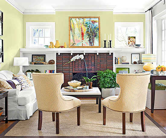
In the above pic the yellow from the painting over the fire place is carried over in the books on the shelf (to the right), the lamp, the flowers, the chairs in a very light yellow shade, the bowl on the coffee table, the pillows on the couch, and the vases on the mantel. See how your eye took a trip around the room?
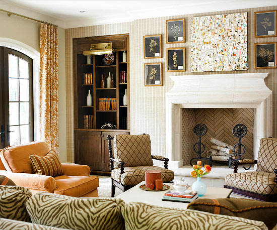
As you can see the easiest way to accomplish this basic design rule is by using accessories in your accent color. You do not need to match the exact hue but as long as it the same color you are in the safe zone. In the next pic, the accent color is orange.
The orange in the painting above the mantel is picked up in the flowers and candles on the coffee table, the throw pillows on the zebra couch, the accent chair and pillow, the curtains and the books in the built-ins.
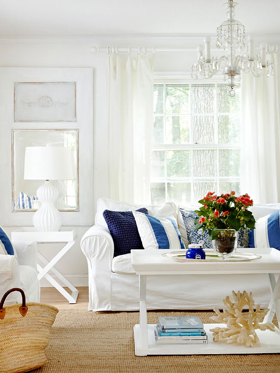
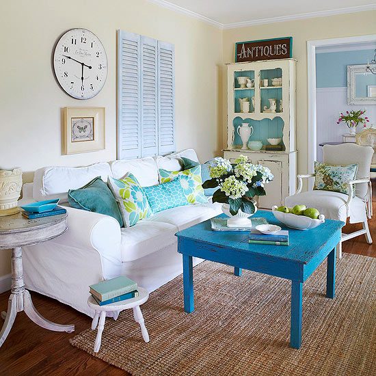
Repeating colors and patterns gives a soothing balanced feel to the eye. The blue in this room makes it way from the bottom of coffee table all the way to the couch and back to the coffee table.
More blue accents. This time they have even picked up the accent color in the hallway.
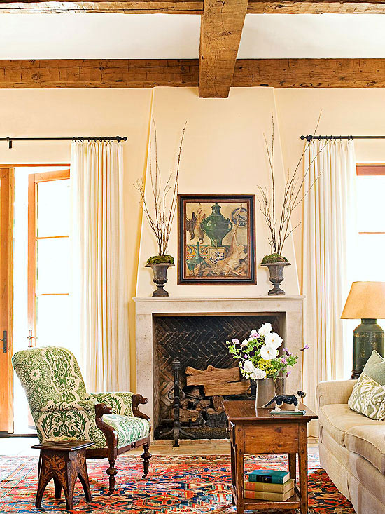
Ready to take an eye trip around this traditional living room?
The green in the painting is repeated in the moss in the planters on the mantel, the lamp, the throw pillows on the couch, the vase, the books under the coffee table, and the chair.
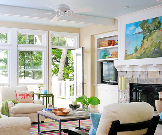
With all this knowledge you think you can add a lil bit of complexity and work with two accent colors as in this room? 🙂
The blue in the painting is mirrored in the accent piece on the side table (can see only a glimpse), the throw pillow, the books on the coffee table, the bowl on the side table next to the window, the vase and the books in the built-ins. While the green is used again in the form of leaves in the vase on the coffee table, the throw, the nesting side tables, and the vase in the built-in. In this pic even the green from the trees act as if they are connecting the dots.
Ready to try this trick on your own? Let me know how it goes.


ah, now i see why some room decors look so soothing…it’s because of a balance of the accent colors. i have real bad decor sense, my apartment doesn’t look even 5% as pretty. learning from blogs like yours and indian summer 🙂
by the way, hi 🙂 i have been dropping by your blog past few weeks. a reader of mine introduced me to your blog when i had a question about my diseased roses and said you might have a solution (they’ve died now, though). 🙁
Thank you for stopping by Nisha. Glad to have discovered your blog too. Roses aren’t very tough to grow. Maybe you could get a knockout rose and try again?
Vidya
Interesting information and lovely pics … thanks a lot for sharing!!!!
Thanks Esther.