I realize that many most of you might not even notice these but whenever I come across them even in pics they bother me none the less. I’ve even messaged or commented on pics of total strangers ‘coz I just couldn’t control myself. If you are a fan of these ideas and have them in your home my apologies in advance. I do know and respect that people have different tastes and likes. In the end what works you is what should be in your home.
#1 Accent walls
Accent walls are great when you don’t want to commit to an elaborate wall treatment (or color, which is where it gets tough) for an entire room. In 60% of the cases they do look good, even great but it is the remaining 40% of the time that bothers me. And I’ve come across many like that, where there is big contrast between the accent wall and the rest of the room paint colors. I feel that two highly contrasting paint colors are jarring and are not easy on the eye when used on a large scale. For example, orange & apple green or orange & turquoise; they look great next to each other on throw pillows etc but not on a big expanse of wall. I somehow prefer accent walls that are subtly different from the rest of the room, which is most often done by adding some paint finish like stencils over the existing paint color. Something like the stenciled accent wall in my guest bedroom.
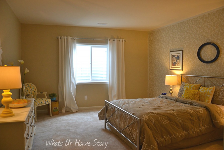
or say a pallet wall like Chris from Just a Girl blog did in her son’s bedroom.
#2 Bright paint colors in bedrooms
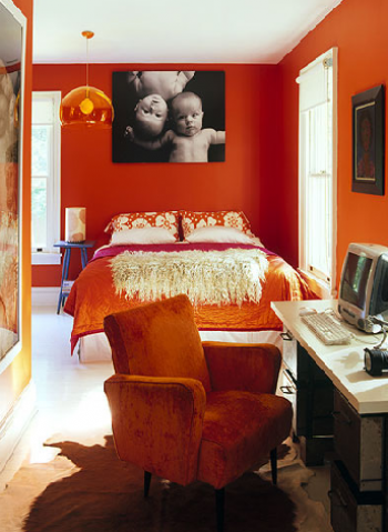
Again something that I don’t get. In general bright colors are associated with energy. Bedrooms are supposed to be a sanctuary and I believe a soothing, calmer color would help you relax much better. I’ve heard folks swear that paint colors do not affect their mood. If you are one of them you are lucky! Sadly I won’t get any sleep in a room like this.
Which brings me to point,
#3 Art hung too high
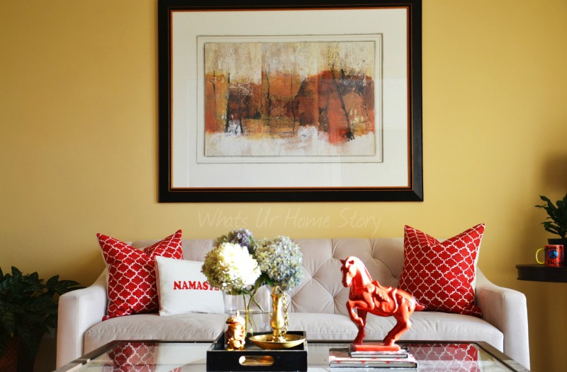
This is the most common decorating faux pas that I’ve come across (above pic). Art should be hung at eye level unless it is part of a gallery wall. Period.
What is confusing to most folks is that “at eye level” is different for everyone. You need to hang it at the eye level of an average person, i.e. 60 to 65 inches from the floor to the center of the art.
#4 Too many accessories
Too much of anything is well…clutter. Adding accessories is how you add character to your home but occasionally people go overboard. You don’t have to display everything in your collection, pare it down and rotate them.
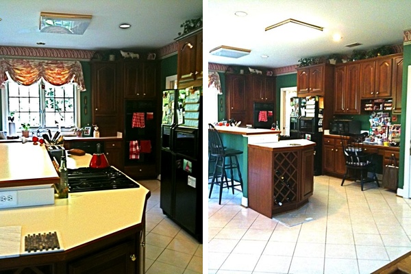
The worst offender in this case is the early 90’s kitchen. Gotto give it to whoever came up with the idea of filling up the empty space above your cabinets with knickknacks only to collect dust. Even if it looks good how do you clean anything up there and when you do won’t all that dust fly down on your kitchen?
#5 Furniture blocking fireplaces
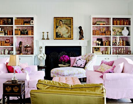
A strict no no unless your fireplace is so atrocious that it needs to be hidden from the public eye or you can pull off something like this.
In this case the fireplace is dysfunctional so it works from the practicality point of view too.
Do you have any decorating pet peeves?



ouch! I”m reading this from my sofa — that’s blocking the fireplace, looking way, way up at my painting on my purple dining room accent wall! oops!
OMG! Almost spilled my hot green tea all over my desk reading your comment. You are too funny. 🙂 Would like to see a pic of your purple dining room wall though. I know I’ll never be brave enough to try a purple wall at least in this life.
V
We love it… It’s not for everyone, but it fits us. I’ll try and post it.
just realized my dining room is in this post– http://www.makeithandmade.com/2013/05/the-easiest-ironing-board-cover-ever.html
and yes. it really is that dark!
LOL! That is just a teaser. Gimme a full view. 🙂 Looks great from what I can see. Like I said, there is always a right way and a wrong way of doing things. 🙂
V
OMG ! You listed the exact decorating pet peeves I have. I am with you on every point.
🙂
Vidya,
I have a 2 story family room, and wanted to fill the wall with 9 equal sized art pieces (not paintings, more like metallic art pieces). What do you think? Please advise.
Deepa
Go for it! 🙂
Ugh the pictures hung too high makes me NUTS!!!
I agree with your five points but I would add one more. My pet peeve is moving the bed in front of the window.